Sunday, 22 April 2012

WHAT/ IS/ A/ LINE? Design development

Following on from my typeface designs for the naming and branding, i decided to use the crystal castles initials as a starting point to design patterns, the four typefaces below were originally inspired my pac-man. 


Crystal granite drawing


Pacman inspired poster nearly complete - i decided to keep the colour scheme for this posters to a liited colour pallet of two. I think think the contrast of black and white work well with each other and lets the obvious stand out. 


Friday, 20 April 2012

WHAT/ IS/ A/ LINE? band member designs

Following on from my poster designs, i have decided to incorporate the band members more into my design. Because i want to create designs to be printed onto t-shirts as well as line-up posters i think its best i show some imagery of the band members.
Over time my idea for what is a line has changed from creating designs for t-shirts that could be stitched into by following a dot to dot pattern. From research i felt his wasn't the best idea for the pattern to be physically stitched, perhaps using stitching to influence my designs would be a better idea. I proceeded to investigate and find more imagery that would be useful to me for what is a line, i found cool photography work which made me think about patterns and shapes and what i could do with them, and how to involve them into my design.
Crystal castles are well know for their video game inspired synths in their tracks, and i thought about the typeface i designed (some pac man inspired) pairing the two i imagine i could come up with some cool designs for a clothing line and lineup posters.

Here is some designs i have been working on:


I thought this design in particular could work well as stickers or small badges often used within merchandise.


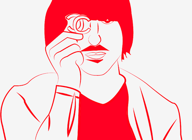
Here is an illustration i done on illustrator from an image of Ethan Kath and Alice Glass, i wanted to experiment a little with gif imagery, and i think this looks quite effective on a grey background simply by layering red, blue and white of the drawing.


Friday, 13 April 2012

Design Principles: Anatomy of type notes

The language of graphic design:

What is visual literacy?
-The ability to construct meaning from visual image and type.
-Interpreting images of the present past and range of cultures.
-Producing images that effectively communicate a message to an audience.

What is visual communication?
-It is the process of sending and receiving messages using image and type.
-It is based on signs, symbols, gestures and objects.
-It's effected by audience, context, media and method of distribution.

Key Elements - Visual language in Graphic Design:
Frame
Format
Form
Ground
Composition
Visual Dynamics
Type
Image
Colour
Layout
Legibility


Sunday, 8 April 2012

Colour theory investigation: Simultaneous

The last part of the colour theory investigation was to show a simultaneous result, this is when the contrast  is formed when the boundaries between colours perceptually vibrate. 


Saturday, 7 April 2012

Theory into practice: Presentation feedback

Presentation Feedback
After the presentation on Friday i realized my nerves got the better of me and i didn't pitch my publication idea very well or put all my ideas out there.
Until now, my idea for my publication was to create a typeface that incorporated aspects of the human form; as i am keen to work with type, portraiture and illustration i thought it was be interesting combination. With this i wanted to create a zine or poster showing the designs.
However i think i confused myself and my presentation peers when i introduced my idea to link my publication to advertising. Personally i think its too much work to handle for the brief as typography alone is the main aspect of my theory into practice brief i think introducing other huge elements such as advertising would make a bit of a mess of what i'm wanting to do.


Plan of action
Research and draw.

Saturday, 31 March 2012

Type and grid: Thumbnails

This task consisted of us picking an article from a magazine, i didn't bring a magazine with me but thankfully Steph loaned my a double page spread of hers. The article was about UFO sightings and the conspiracy of aliens existence.  

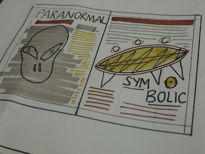
We had to use our template we made in the previous session to guid us in creating small thumbnails, each dissecting the original layout of the magazine and creating our own interpretations, here are the following:


in particular i like this one, i think the layout suites the theme of the story, i intend to use this thumbnail to recreate for the indesign task.

*** add other sheet of photos