Saturday 31 March 2012

Type and grid: Thumbnails

This task consisted of us picking an article from a magazine, i didn't bring a magazine with me but thankfully Steph loaned my a double page spread of hers. The article was about UFO sightings and the conspiracy of aliens existence.  

We had to use our template we made in the previous session to guid us in creating small thumbnails, each dissecting the original layout of the magazine and creating our own interpretations, here are the following:


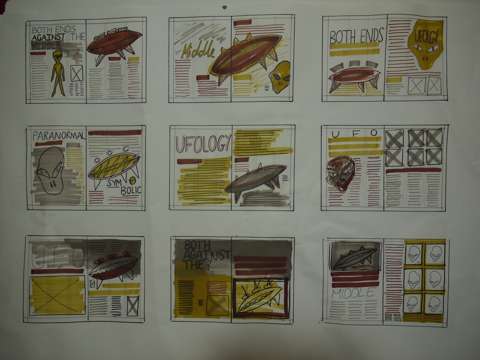
in particular i like this one, i think the layout suites the theme of the story, i intend to use this thumbnail to recreate for the indesign task.

*** add other sheet of photos

Type and grid: workshop with lorenzo

For Lorenzo's workshop we were asked to bring a template of a basic 16x11cm thumbnail to work from.


 Here is the grid line ruler we cut out to help us measure accurately for the task.


Initially i didn't understand the idea at all, but after few attempts i grasped how type and grid worked and why it was necessary, i feel this is a task i need to experiment more with to fully understand layouts on a page. 


NOTES:


Type and grid

- Components
- Weights and sizes
- Styles

10pt leading 10/14pt 
For body type 4pt

X Heights:
- Can't judge point size by the X height
- Same point size but different X height impact on visual size

Using type:
- Readability
- Hierachy: Headings, sub headings, running heads, intro body, captions, folios.
- Specials, breakouts, pull quotes, drop caps.

Transport and medium:
-Font transport, medium and bold were produced in the UK 1958

Reverse out:
- Switch 'black and white' foreground and background

Tints: 
- Different emphasise through colour

Layout:
- Application (bible, cookbook, manual, novel, script, magazine)
- Grids
- Conventions, paras, columns, justified, line length

Thursday 29 March 2012

Theory into practice: Presentation


-Firstly I began my research by understanding how type originated and how it has changed through the ages. 
-Cuneiform scripts is one of the earliest forms of written expression.
-Our modern English alphabet is a child of the Latin or Roman alphabet, which evolved from a western version of the Greek alphabet and it’s the world’s most prolific and widespread ABC.


I wanted to familiarize myself with the anatomy of type, what letterforms are by each of their characteristics, and how to design a typeface from scratch by investigating the elements of typography.


- I also looked at influential or more so famous fonts circulating, a few such as Helvetica, Futura, Garamond, Bodoni, Frutigar, Trajan, Myriad, Minion, Membo, Baskerville, Rockwell, Verdana, Franklin Gothic, Times New Roman, Gill sans. 


- After the History of type lecture, i researched further into typefaces which designers had used the human form to build their letter forms. All of which i like especially the medieval style one, top left. 


-I would like to illustrate the elements of portraiture, fashion figures and other design components to combine image as typography.
-My reason for this is because I would like to write an article for a fashion magazine/ create a zine which would inform the audience about how image and text are intertwined through the use of advertising. 


-An ideal example of this advertising style is shown by my favourite illustrator Laura Laine, her design approach seems to be these dark elongated figures representing high fashion models posing for and help selling the brand chosen; as life like as Kate Moss would. 


Here’s a few articles I’ve found about MM Paris and Laura Laine, just to get an idea of a suitable layout what I would like to achieve.
Things I need to consider – Legibility of the typography and how it will work within an article or in a zine over all. 

last side
Things I need to consider – Legibility of the typography and how it will work within an article or in a zine over all.
Outcome- Design an double page spread OR zine informing and showing viewers about the aspects of image and text and how they work together through the power of advertising.   


http://www.smashingmagazine.com/2012/03/14/respect-thy-typography/
http://ilovetypography.com/2009/12/08/graphic-masterpieces-of-yakov-g-chernikhov-the-collection-of-dmitry-y-chernikhov/
http://www.notpaper.net/2009/03/the-unfinished-body.html
http://www.lib.utah.edu/collections/rarebooks/exhibits/past/abc.php
http://www.thisiscolossal.com/tags/typography/page/9/

Wednesday 21 March 2012

Stamp it: Stamps complete


Stamp it: Design Process


STAMP IT.

After looking through my research I decided to concentrate on the ‘global warming’ side of things. I learned that the temperature of our planet is consistently rising and if we don’t react, reduce and reuse soon the affectS will not only affect the human race but every other living thing.
According to scientist the arctic ice is melting more and faster than expected resulting in sea levels to rise and inevitably reducing the life of animals in their habitat.

I have planned to design stamps that generate in peoples minds and will make them more familiar of the happenings associated with global warning, and to be alternative all the public need to do is think about the temperate of the earth and the effects of it.

Here is the development of my designs:
Initially i found some images of 6 polar animals i would like to use to illustrate in my designs, here are the follow snow seal, penguin, polar fox, polar bear, snow weasel and walrus. 


My idea was to make simple head illustrations of the animals which looked relatively like ice lollies! I wanted to engage the thought of melting ice caps into something perhaps child like so that the stamp would be suitable and attractive for all ages to look at as I assume most people are now aware of the climate situation, I think the child like touch to them seems appropriate. 


By using simple shapes and the pen tool i was able to generate some polar animal vectors.


In the above image i have placed a silhouette of the queen in the top right corner of the stamp, i used this from previous design work i had done in the Rain poster brief. 


Whilst designing i had an idea to turn the polar ice lolly sticks into thermometers, i believe this works as it is visualising this idea of how temperature is affecting animals and their habitat. 

Individual stamps complete:
As a set i'm happy with the out come of the stamps, i think once the first day cover is complete and printed i think it will all tie together and inform.