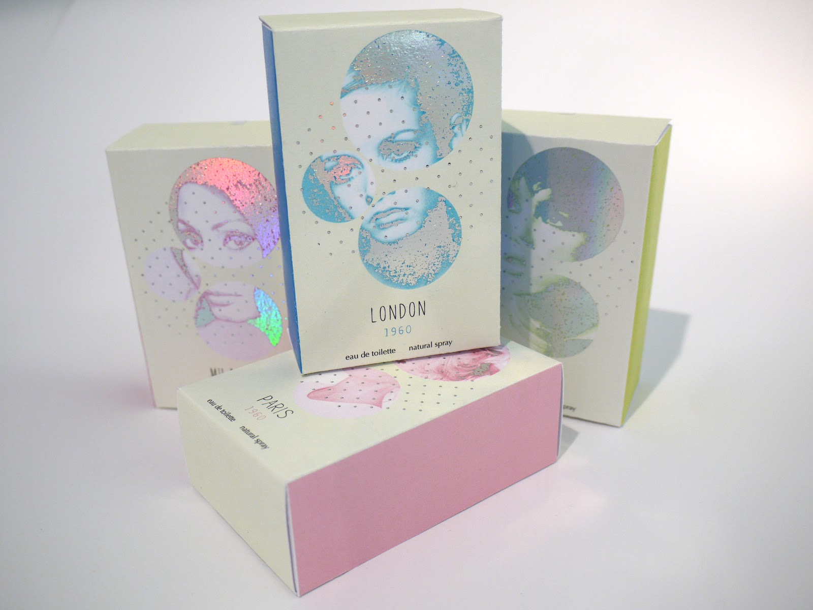
I produced the nets for the perfume packaging from a net of an existing product I had deconstructed along with the written content. To develop scent for each of the perfumes I gathered my favourite perfumes and wrote down the scents that the fragrance reminded me of to develop a scent palette for each of the 1960 perfumes. I wanted the packaging to be colour co-ordinated and have subtle sixties influences in the designs such as the circular shapes used throughout and the icons women portrayed on the designs.
Perfume packaging
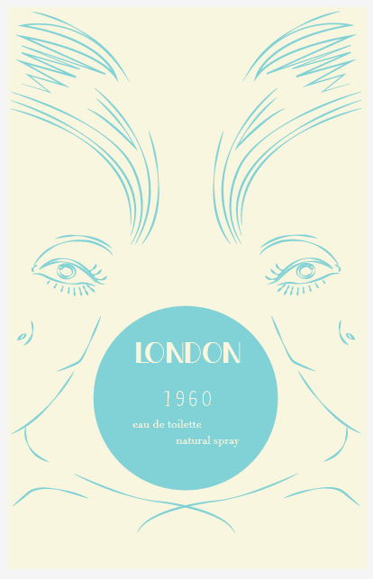
1960 - London
1960 - Paris
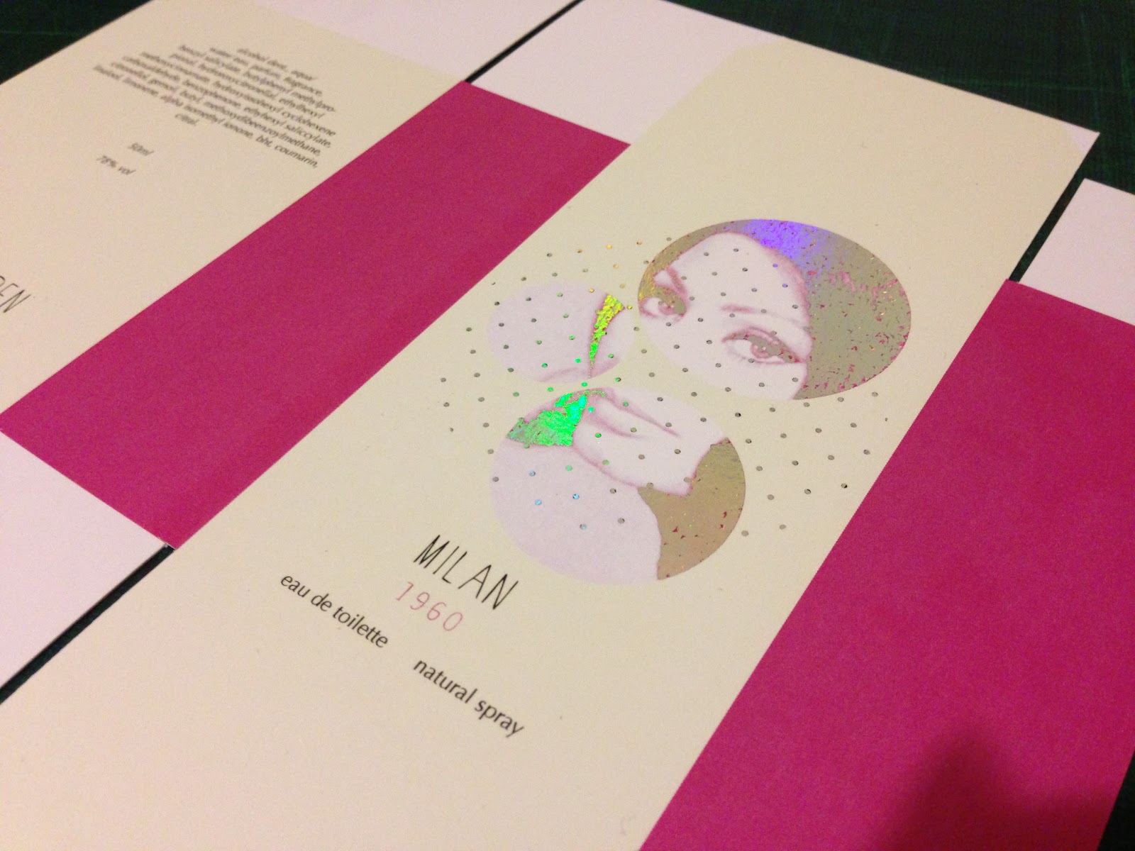
1960 - Milan
1960 - New York
Sample packaging
The samples are designs which were relevant as they are what a customer would spray a perfume on before purchasing a chosen scent. I wanted to keep them quite simple yet still have a consistent style throughout.
Magazine advert/ Poster
Design development:
I started off with a simple illustrative design.
To combining imagery from from two of the fragrances , London and Paris. I think the colours on the poster complement each other and the composition of imagery works well.
Final design:
I opted for a surreal looking composition, the poster promotes a new collection of fragrances called 1960, showing a variety of names, London, paris, Milan and New York. All of which can be seen on the website given and can be accessed through the qr code.
Website