During the lesson with Fred we were asked to answer a list of questions, the aim was to unpick the brief, break it down and fully understand it.
Initially i chose the Douwe Egberts brief for the lesson to break down, here is the results of what feel about the brief:
1. Why have you chosen the brief?
- Because other than starbucks and costa, coffee seem almost old fashioned, so being able to generate something new would be exciting.
- I'm not a tea or coffee drinker, so choosing something i'm unfamiliar with could be challenging.
2. What do you want to get out of the brief?
- Have my work seen.
- Wint he competition.
- A better understanding or real briefs other than college briefs.
- To be able to communicate as a graphic designer.
- Gain contacts (if i win)
- Develop new skills, demonstrate my strengths.
3. What do you want to do/ propose in response to the brief?
- Redesign something for a popular brand.
- Experiment with different packaging design.
- Create something appealing and fresh for younger audience, without losing the heritage of of the brand.
- Diesign good quality products.
4. Why do you want to enter the brief?
- Gain confidence.
- Be part of the design realm.
- Be part of the competition to win the competition.
- Fell proud of my work that i've produced.
5. What is the problem?
- To increase awareness of the Douwe Egberts brand.
- Make it more popular with a younger audience.
- To encourage people to drink coffee at home.
6. What is the brief asking you to do about it?
- How to create something that makes the brand of coffee appealing to drink at home.
- Design a product that is contemporary yet still holds its heritage.
- Get younger people talking about the brand, make it popular.
7. What is the brief trying to achieve?
- Generate excitement about the coffee.
- Attract a new audience.
- Get younger people talking about coffee, make it popular.
8. What are the ten most important words in the brief?
- Douwe Egberts
- Communicates
- Young consumers
- Contemporary
- Heritage
- Home
- Desire
- Identity
- Create
- Appealing
9. What is the message/ concept?
- To challenge the drinks market.
- Encourage younger consumers to drink coffee.
- Make coffee drank at home as appealing as drunk in a shop.
- Increase awareness of the brand.
- Step away from old fashioned theme.
10. Who is the audience?
- Younger generation.
- Those with a thirst for knowledge.
- Those who like to experiment.
- Food and drink lovers.
- Those who pay for quality.
11. What is the context?
- New identity
- Heritage
- History
- Coffee
12. What products do you associate with the brief?
- Existing coffees ( Nescafe, Kenco, Maxwell etc).
- Costa and Starbucks, the younger consumer - competition.
13. Ways to win the brief?
- Range of products.
- Original design concept.
- Follow the requirements.
- Appropriate designs, consider audience.
- Clear communication.
- Good quality designs/ products.
- Imagination.
- Enjoy the brief.
- Level of intelligence.
- Expert of the subject.
- Well informed design.
14. Identify what you have to do?
- Include the DE logo.
- Create a campaign or products.
- Bring a modern and contemporary feel to the brand.
15. Understand what you need to do?
- Have the correct audience in mind.
- Use relevant information.
- Have a well executed design.
16. Define what you can do ?
- Come up with innovative ideas.
- Produce a range of products.
- Create/ design something fresh and desirable.
- Use tag lines provided. (not essential though)
- Well executed and well produced.
17. Speculate what could you do?
- Surveys.
- Primary and secondary research.
- Investigate into previous branding ideas.
- Look at the new market.
- See what drinks are most popular with a younger audience, and perhaps apply design methods to the coffee brand.
- Think of ideas aren't realistic too.
18. What hasn't been done before?
19. What do you know already ?
20. What do you need to research?
Wednesday, 28 November 2012
Tuesday, 27 November 2012
Design for web: Crit feedback
Crit Feedback
Insert images
Strengths:
- Aesthetics of web page are relevant to topic, links well to fashion blogs
- Chosen images are fresh and bright
- Easy to navigate
- Navigation bar layout and designs look great
- Font used suit the website content
Areas for improvement:
- Need to be careful with image copyright, need to state source of image as well as where to purchase bags
- Would have liked to have seen design direction boards
- How it functions, the layout of the images would work best if the text and images doesn't move to the left, instead centred, would be more consistent
- Perhaps when enlarged you could make it go over the top of the other images, make them more noticeable by dimming the light on the rest of the content
Considerations:
- Typeface - Daisywheel is most clearer, less distracting from content
- Black and white idea would work really well if navigation is changed to a solid colour, something that will really stand out, pink perhaps?
- Where would extra info expand to? would be most effective if it popped up in the middle
- How will images shown on homepage be different from the rest
- Keep typeface consistent through titles/ links/ body copy
- Maybe you could do a fashion illustration to cover background?
After receiving my feedback i had a quick talk with Loraine about my design, she said the to not complicate my website and keep each page individual, no links between the home page imagery and the page image (still sharing the same images) just not complicating think by crossing over with pages.
Monday, 26 November 2012
Design for web: Final homepage/ How it will function
Stage 1.
Final Layout design, i wanted to keep it simple as i'm not confident with making anything difficult on dreamweaver, hopefully the simple box imagery will work and look appropriate for the the content.

How it will work:
To scroll down the page hover mouse down the lower part of the site and the images will continue to appear.
Any image that is hovered over will have a highlighted box appear around it with a bigger definition box open up showing the user what the hand bag is, where to buy it etc.

Pages:
Iconic bags - Will be a page the user can click on to see all the famous handbags from fashion history, whether it be the ultimate 'it' bag, or an iconic design or any handbag which has never went out of fashion.
Bags in Paris - Will be a simple page, nothing more than a cool video of snap shots at Paris fashion week, all handbags related.
Celebrities bags - Which celebs is in the lead with the latest trends and where you can buy the exact bag or a high street version.
The Satchel - Is referring to 'The Cambridge Satchel', a homemade business which took the fashion industry by a storm, this page will give the user the inside story about the designer, the bags, who owns them and where you can purchase one yourself.
Stage 2.
I intend on designing and digitalising the above four pages, shortly after i will then create my final website in dreamweaver and see if it functions properly and looks suitable for my theme 'handbags'.
Design for web: Digitalised scamp
Here is the digitalised version of my final scamp, i chose to design a mosaic style layout as the images i will be applying to the home pages are an assortment of handbags, i believe this layout is simple yet effect, i was inspired by the likes of tumbler and i-D for the design.

Here is a slightly altered layout design, i thought having some white space on the site would make it look less cluttered giving that there is 20-30 images on there.

Pixels per inch measurements:
Title box - W: 156 px H: 40.333 px
Page boxes - W: 115.005 px H: 15.333 px
Large image box - W: 237.5 px H: 236.833 px

Medium image box - W: 156 px H: 155.833 px

Small image box - W: 74 px H: 73 px


I like brightness of all the bags on the page, however i quite like the idea of the home page being initially black and white until the user hovers over and image and the coloured image appear with and explanation either about the bag, who the celebrity is, where the bag is from etc.


Below 'the bags' is just a substitute name for the website, as i'm unsure what to brand the site as yet.
Font decisions?
Daisywheel
C7nazara
Eccentric Std
Blake

Design for web: Crit feedback
Before the crit Loraine asked us to write down five questions we wished to be answered about our work, here are the following:
1. Is the layout of each design suitable for the content, does it work well?
2. Which of the three scamps suits the theme bagology, does the astrology theme work on scamp two or does it seem irrelevant?
3. Would you suggest photographs or vector handbags?
4. Have i explained the navigation correctly, do you understand how the website would work?
5. What additional elements would you add to the website if this was your theme of design?
Crit Feedback:

I was happy after receiving some positive as well as constructive feedback, my crit group thought the bagology theme would work well as they liked the unique design that wasn't stuck to a grid, however i realised that going down that theme root wasn't really exploring the rest of the research i had discovered about the history of handbags and i wanted to use existing imagery on my website instead of having to make everything from scratch. I think this design approach will be a less time consuming way, even though i do want to design a quirky and rememberable website, i think sticking to something simple and easy to navigate is the best option for my first website design.
However, once i feel i am confident using dreamweaver i might consider developing my website into something more imaginative and challenging.
Design for web: Scamps
Here are some photos of my initial scamp ideas, the idea was to base my website on the 'bagology' theme i explored when research a History of handbags.


Tuesday, 20 November 2012
What is design for print: Info pack/ Final Pages
As this is only a starting point for my entire design, i thought it was best to show the development of the layout and content of the leaflet. My plan is to make other versions of the leaflet in the same style yet the content will be a more in depth and informative brochure about print processes, i also aim to do some of the processes myself, such as screen printing, embossing, de-bossing and foiling as i think this will add character and meaning the the additional product given that the theme is 'print'.


What is design for print: Info pack/ Vector development
I thought it would be best to start off by drawing some imagery for my print info pack before laying everything out, here a few of my designs i would like to use in the info pack.
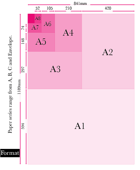
Firstly i started with designing the format of A series paper, this is to show the user about size and scale of stock.

An illustration of a piece of paper to represent stock used when printing.

A play with colour models, testing shapes for showing colour such as hue, saturation and value.


An illustration to represent art work before it is printed.

A vector design of a printer to symbolise the printing process.

Drawings of the types of folding and binding one can do one the product is printed.


Wednesday, 14 November 2012
Design for print and web: Dreamweaver/ designing webpage 2
Resized to aligned centrally

Margin left is - half the width of the container

Editable column boxes


Page designs

Photoshop to design buttons


Code for button arrangement


Subscribe to:
Posts (Atom)