Wednesday 24 October 2012

What is design for print: Design sheets

Here are a few images of my design sheets, i have generated a few different designs ranging from booklets to leaflets as well as information in packaging. I believe at least one of the design will be useful for me to begin designing. 


Design for print and web: Software workshop

ollymoss.com


Black, simple, empty, negative, space, small.
Index hibit, simple text.
Should be the content that makes the design look good, not the design of the website that makes the work look good.
Content needs to be visually appealing.

malikafavre.com


Feminine, fashion, women, squares
Produced using cargo, similar to index hibit, content is initially there.

caavadesign.com


Round, pokamon, urban, awkward, california, pastels.

serialcut.com


Face, moustasche. boselcta. keith lemon, tony and guy.

mylapka.com


Ikea, Sweeden, white, space, lego.

cat-bounce.com


Silly, cats, bounce.

3 questions

- What is the purpose of the website
- Who is the target audience
- What do the target audience need

Online portfolio

- To display your work
- Access to clients
- Networking
- To get job
- Target audience (agencies, potential clients, artists, other freelancers)
- Contact details
- Experience, past clients

Designing for web

Text
Image
Navigation

4 restriction when building a website:

Size
800x600 pixels wide - if you want something to work on a selection of screens you must design for the smallest screen available.

Different resolutions
72 pixels per inch (initial display) - 96 pixels per inch - 227 pixels per inch (retina display)

Fonts
You have to pay to use fonts when working commercially, pay a license fee, adobe font folio.
Limited range of standard fonts for example - Verdana, Georgia, Arial, Courier.
Default font is Times new roman in every computer.
Web kit can allow you to embed your fonts into your website.

Colour
Every image you see on screen is RGB.
Make sure colours are consistent for access.
Hexadecimal colour code for red #993333
Example in photoshop


Books for web design
HTML and CSS: Design and build websites by John Duckett
CSS Mastery: Advances web standard solutions by Simon Collison

Web terminology for language

HTML - hyper text markup language
CSS - cascading style sheets
WYSIWYG - what you see is what you get
URL - uniform resource locator
FTP - file transfer protocol
CMS - content management system

Safari - view - view source
Graphic representation of coding


Web design work flow

-Get a brief
-Put together a scamp, at least 3
-client will choose a design
-Sign off work
-Produce digitally
-Allow emends 

Web design as a group
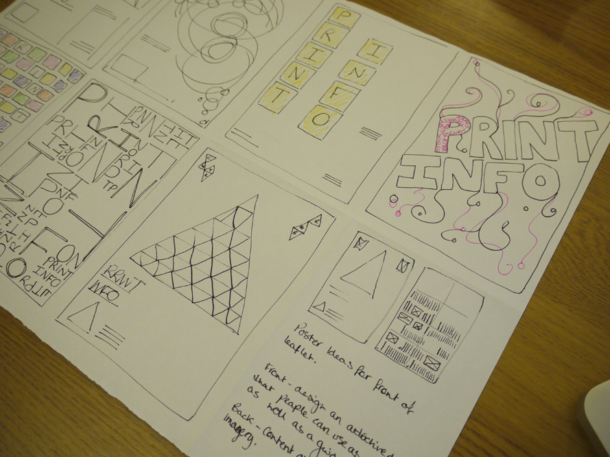
Here is a scamp we made as a plan for what the final result will look like

Web design for own website
Start designing scamps 
Font 
Colour 

Design for print and web: workshop

Things to  consider for a website:
Promotion
Informing
Persuading
Contact
Entertainment
Audience (everyone is never the answer)

3 important things for a website:
Usability
Aesthetics
Functionality

Considerations:
Clean layout
Navigation
Redundant feature
Grids

Website design (what i would apply):
Home page
Name
Logo
Job title

Contact info
Name
Studio/ Address
Email
Phone number
Social networking

Latest work
Recent projects
Exhibitions

Portfolio (a range)
Graphics
Illustration
Photography
Collaborative

Shop
Clothing
Posters
Other

Bio
Who am i?
Location
CV

In todays session we had to design a web layout what we thought would be best suiting for ourselves to showcase our graphic design work.
I'm not exactly great with layout, it's something i need to work on a lot. My design wasn't anything special and i don't think i explained my ideas very well on the design. There was confusion between links and info so i didn't get great feedback.
(insert image of design)
Never the less here is my feedback:
-Good layout, each element is easy to see by seperating
-Good use of website area
-Usability is good
-Video idea is great, make sure the user chooses to play it rather than automatically if there is sound
-Simple effective layout
-Sample video on front pages is a good way for audience to see how you work and at their choice
-Nice separation in work

-Links in different places? could be down the side with the rest of info
-Unnecessary scroll bar and links section
-No need for double box
-Not sure if you require all links on the side
-Too many pages
-To generic

Tuesday 23 October 2012

Design for print: Indesign workshop

Types of binding
-saddle stich (multiple of 4 pages)
-perfect blinding (multiple of 2 pages)
-ring binding

Readers spread ( the pages appear in indesign exactly the same as the book will look once the pages are printed and bound together.


Printer spreads
Layout on screen as it will be printed and bound, for printer spreads, pages need to be re-ordered so that the order of the pages link. (can be done on indesign)
Do mock ups, to make a note of which pages go next to which.

Method of calculating left and right hand pages

L   |   R 
  8    1        Each pair of number adds up to 9
  2    7        Page 1 (front and back)  
  6    3
  4    5        Page 2 (front and back)

Page numbering:
Type tool bar to select page numbering


When printing select - print booklet
Print settings - no preview as its booklet not standard print
Always check print black pages
Setup to choose paper size
Always set page position to be centres, to the content lines up
If you are working with bleeds add crop marks
Printer - shows print dialog box
Select long edge or short edge binding

Postscript files
Adobe PDF 9.0
Selecting this print method allows you to print all the way up to A0, A4 double side plus bleed

Book PM files
Embed all fonts and files within
Very similar to a PDF

Friday 19 October 2012

A history of/ Survey results stage 1


After looking through the results from my survey, i have gathered that most people use a bag as its an essential item to have; items need to be carried. People look for a bag thats practical, has space to carry large and small objects and is stylish. 


Thursday 18 October 2012

A history of/ survey: What does your bag say about you?


Here is a survey i have put together to gather information from an audience to analyse whats the essential content of an individuals bag, so far my only audience is the graphic design class, but i think that will do for now!

What does your bag say about you?

What style of bag do you use during the day?
-tote
-backpack
-handbag
-satchel

Do you use a bag every day?
-yes
-no
-often enough

Is your bag an important/practical accessory?
-yes 
-no

Whats your favourite (s) style of bag?
-baguette
-clutch
-drawstring
-messenger bag
-satchel
-tote
-backpack
-shopper

What do you look for when purchasing a bag?
-practicality
-pockets
-space and size
-handle adjustment
-style
-material

What materials do you prefer?
-leather
-faux leather
-canvas
-suede 
-plastic
-polyester
-cotton

Does the latest trends influence you on what bag you buy?
-yes
-no

Do celebrities influence you on what bags you opt for?
-yes 
-no
-sometimes

Is the brand that designed your bag as important to you as the bag its self?
-yes
-no
-i like variety 

Most often what do you carry in your bag?
(please list content)

Link to survey:http://www.surveymonkey.com/s/CXSBT76

Tuesday 16 October 2012

Design for print: Indesign workshop

Bleed - make accurate for printing/ trimming, standard amount is 3mm.
Printing - Different printers, different bleeds, consult with printer.
Slug - for trim marks, registration, printer marks, lost once document is trimmed down.
Primary text frame - each frame will be link from one page to the next, automatic flow of text.

Order of pages for a publication.
A | A - master page
Every thing you apply the master page will be on every other left hand page.


To unlock a master page item - cmd, shift, click and delete.

New master page:


Colour is similar to illustrator.
Transfer swatches. cmyk - small icon next to grey squares in swatch palette.


 Choose from a selection of pantone choices, or type in an already identified pantone colour.

Create tints by selecting the spot colour, adjusting the tint then dragging the tint colour into the swatch palette.

Before dropping images in to indesign you must consider things in first:

PHOTOSHOP
1. CMYK colour mode or greyscale
2. 300 dpi for print - resolution
3. Actual size, don't enlarge in indesign as you lower the resolution
4. Decreasing the size of image in indesign, can cause errors best to prepare all items before hand
5. Save as PSD or TIFF file (tiffs don't support transparency)

ILLUSTRATOR
1. CMYK
2. Save as AI, copy and paste
3. You can scale image down in indesign as images are vectorised

Moving art work from illustrator to indesign:
Place
OR
Copy and paste

Grey scale tiff into indesign, you can create a monotone in indesign
Select the image, within the frame, brown frame


Inner circle to chage the colour of the image
Outer circle to change the colour of the back ground
Re- editing the images (having to change size etc)
Hold down alt and double click on the image
OR
Alter image in photoshop, save and close PS and image will automatically update in indesign
Transparency in PS
Double clock on background, change to layer 0
Select magic wand tool, select background and delete, save as photoshop and then open in indesign


Colour separations / positives: Same process for creating positives for screen printing
Window
Output
Separations preview

Research print processes:
Output
Overprint preview
Tracking or trapping

Friday 12 October 2012

Design for print: Packing task/ extended designs

Here are a few images to show the design development of the branding for Zara i did, i experiments with colour, pattern and shape to get these results:

Development of text.


Below are a few desgn which could be used for tags or expanded and printed on bags for zara.


Or here is a logo i designed, this could be used for rebranding.