I created some colour palettes which were inspired by the tones often used in sixties clothing and advertising, I didn't want use an actual colour palette from the sixties as I didn't want the products to look from that time, instead I wanted a more contemporary yet retro style to them.
I then edited some imagery on photoshop using the matching pantones from my colour palette.
As my products were based on the sixties I thought it was only appropriate to brand the product range '1960'.
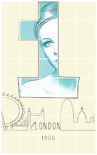
Here are a few initial digital designs for the front of the perfume box - London.
Packaging cover designs for 1960 - London fragrance.


No comments:
Post a Comment