Insert images
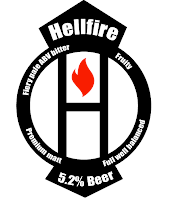
Here are some simple drawings i put together for a concept behind the design. Given that the beer is called Hellfire i brain stormed some ideas as to what relates image would relate to the name.
Eventually i thought of a symbolic idea, something rememberable once figured out yet attractive to the eye regardless.
Hellfire concept
The four classical elements:
Fire
Earth
Air
Water
I thought it would be interesting to designing something quite simple and conceptual, the deist strategy i was going for was to keep the label looking fresh looking with a modern twist.
Here is the development of my designs:
Experimenting with different fonts
I didn't feel like the lower design works as well, it looks too much like prevent danger designs as apposed to beer bottle designs.
Further experiments
These three were my favourite over all, i decided to mock them up on beer bottles to see what the labels would look like if they were to be used.
Final design:


No comments:
Post a Comment