Friday, 5 October 2012

Design for print: Nets workshop

During this workshop we were asked to pick 5 pieces of packaging that we had brought in to the pervious session in order to use the nets to be able to apply branding to them.

5 examples of packaging:


(take photos and deconstruct plus take photos)

Here is one of the nets i chose to use for the workshop, with this i applied the lilt logo to it in order to experiment with layout and branding of a product.

(insert image of net box and lilt logo)

We were then asked to draw the nets out onto A2 sheets and draw and develop as many different versions of the logo as possible, to create a range. Here are some images to show how a logo can be altered and applied to a product in a different form.


We were then told to go away and continue this task to generate a range of nets, however i wasnt s keen on producing packaging with the logo lilt applied so i changed my idea and used the zara logo instead. 


Thursday, 4 October 2012

A history of/ 3 x promotional material: Final designs


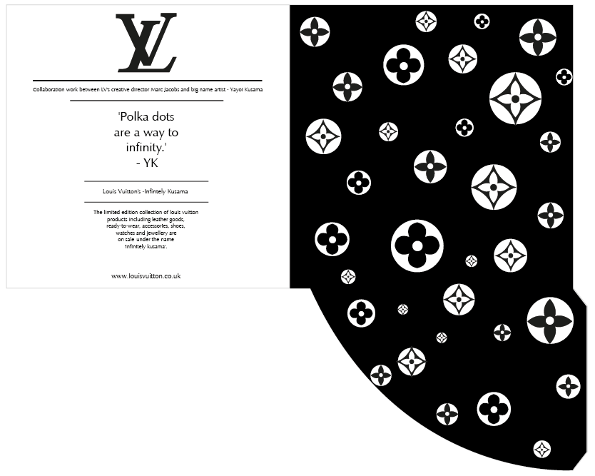
Here are my final products, as required i have designed a poster a flyer and an envelope. The three pieces of material promote the collaborative work between and artist and a designer, they indicate what the significance of the collection is all about and where to purchase an item from it. 

1. Poster


2. Flyer


3. Envelope


Wednesday, 3 October 2012

A history of/ 3 x promotional material: Design development

For this task i decided to concentrate on designing promotional material around something real, it being the promotion of collaborative work between Marc Jacobs (creative director at Louis Vuitton) and installation artist Yayoui Kusama. Together they created a collection of handbags and accessories with the theme of POLKA DOTS!.


Design development

Illustration of Yayoi Kusama


Potential stickers


Envelope net
Inner cover design


LV Logo design

LV pattern design


Information about collaborative work

Pattern from art installation 

Final Designs

Outer envelope design 
Inner envelope design


Tuesday, 2 October 2012

A history of/ Crit feedback


FEEDBACK

Positive Points
- Range of relevant design solutions as part of design development
- Insightful information presented
- Interesting facts about the evolution of handbags
- Great facts about psychology of handbags (the way i told them)
- Good topic and good illustrations
- Interesting facts and figures
- Tell its an area of interest
- Good depth of research
- Nice final products, suits style and topic
- Possibilities could be explored, very interesting to see where it could be taken
- Some research i never knew existed
- Loads of information

Negative Points
- Try to avoid reading directly off notes when presenting
- Make text larger on posters, or print bigger
- Make use of the photography i do
- Maybe should of used powerpoint to make slides bigger

Design for print: Studio workshop

Difference in printing quality?

-Stock
-Simple or complex design
-Net layout
-Colours (subtle or bold)
-Foiling
-Laser cutting involved 
-Double sided printing
-The amount of packaging (pull outs etc)
-Size of packaging
-Country made
-Environmental consideration 


Top
-Nice feeling stock
-Sustainability
-Looks expensive
-Durability
-Net complexity 


Middle
-Disposability 
-Good durability but design doesn't match
-Not amazing design or stock mundane 
-Familiarity 


Bottom
-Overcrowding
-Mass produced
-Poor quality images
-Attempting mimicry 
-Unnecessary packaging


Monday, 1 October 2012

A history of/ Bagology posters


I was unhappy with the final product i had produced, so instead i decided to apply the content to a different type of product. I thought posters would be the best option, simple and effective, easy to read and they could be places in different contexts. 

FINAL POSTERS


PRIOR DEVELOPMENT