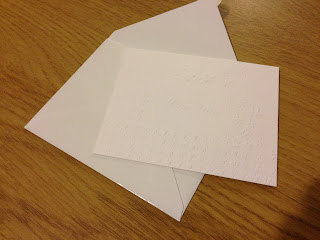
Here is a perfect example of an attractive perfume format, i came across this tester in Vogue magazine, it's purpose is for the reader to engage the promoting brand and to interact with promotional object, this being a perfume tester for Dior. These perfume testers are often found stuck onto a page in a magazine.
The small white envelope is made from a glossy stock and has a the classic Dior logo debossed an foiled as a finish.
The classy looking envelope has a scented piece of card inside which smells of the promoted perfume, its an interactive and tempting tester due to the laser cut diagram of the perfume bottle as well as has intricate designs on the front of the card.
Another example of this is the Miss Dior perfume tester, i believe this has a similar look to the previous example as it is by the same brand Dior.
The slight design differences are the shape of the envelope as well as dogtooth/ floral pattern embossed onto the scented card. These types of processed are something i will bare in mind for if i wish to design something similar at a later date.
Another ideal example of how testers can be applied to a magazine page, this type is more of a sticker, on the front there is usually a printed perfume bottle and logo which incorporates into the design of the page spread. And on the reverse side once unpeeled is a silver foil with a scented fabric attached whereby the user can test the perfume on their skin. Below is an example of how this is put into practice in the male Viktor & Rolf fragrance advertisement.
A few more variations of this type of tester design for female fragrances.


No comments:
Post a Comment