For the design for print brief i decided to stick with the old design plan i originally had, and that was to make a leaflet, i wasn't too keen on making a manual as i prefer products that you can play with such as fold out.
Here are a few shots to show the design development of how i generated my product.
To start with i went back to me design sheets and looked at some of the layout drawings i came up with, here is the template i designed to use for the arrangement f imagery and text.
These are the options for colour palette choice, i thought sticking with a colour scheme would make the leaflet look more appealing and individual. I particularly like a black and white palette with a bright process colour as this makes a product more noticeable.
Inspired by the original A series paper diagram, i designed my own, its very simple yet still makes sense.
I also designed table which explains the measurements of the series A paper in millimetres and in inches.
A diagram to show the other series of a paper which are available for printing.
Here is the first page of my leaflet, lay out wise i am quite pleased with the result as layout isnt my strong point. The colour palette choice i went for is black, white and yellow, this was chosen because i wanted to incorporate a pigment of the CMYK inks as the product is all about print.
Unlike my original leaflet design i have incorporated photography into this one, i thought having real life imagery would be more useful for the viewer to look at as some of my previous vector designs didn't look suiting enough.
On pages of the leaflet i made black boxes with white text, this is to make the content stand out and to show that although the text isn't a lengthy paragraph it is an important aspect of print.
I think having a template to start off with really helped me when placing the text in, really i should of designed this on indesign, but i found it just as easy to on illustrator.
As my leaflet had a colour scheme i think having anything to garish on the colour page would have caused inconsistency in the over all design, so instead for the colour pages i design subtle yet relevant blocks of colour which demonstrated hue, saturation and value within colour theory.
The sam applied when trying to involve CMYK and RGB, i wanted my leaflet to be quite simple, informative and educational without being too cluttered on design.
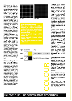
The second colour page of my leaflet involved explaining how colour works on screen for example when working in adobe photoshop, below are some diagrams i drew to define what dpi and ppi resembles as a zoomed in image.
This image shows the ink options when i photoshop, it shows the choice of colours one can use when wanted o create duotone artwork, this is usually a selection of two colour sometimes even a third.
For the printing page i decided to keep it mainly information based with only two images, first is a diagram which shows the idea of offset rollers rotating to transfer ink to paper.
Another is an example images of what a screen printing screen appears like after being prepared and exposed with text, ready to print with ink.
I think having all the photographs in black and white works and looks consistent, and doesnt change what the image needs to say, although there is now colour it is still clear to see the effects of embossing and debossing.
An image to show the process of foiling using rollers.
Here i have used the illustrations i designed on my previous leaflet, they show the variety of binding and folding option one can do once they have their final products printed and finished.
Over all i'm really happy with the style of the design as well as the informative outcome, i believe there is enough information here to improve an individuals knowledge of printing and the process within it.


No comments:
Post a Comment