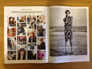
J.W Anderson - Topshop
Consider names for the publication or even a logo design.
Whether to add graphic elements or not.
Consider images sizes for page layout.
Perhaps a juxtaposed element to the pages to show a collection or series of imagery.
Front and back cover designs, which could be the one final image or a words, slogan, pharse in relation to our theme.
Asos
Front cover could a shot from the event we organise.
Arranging imagery in a side by side order, this could work on numerous pages of the publication.
Having a feature page of 'what to wear' for the event. Take photos of individuals and their clothing, this is a relation to what people where to music events as well as an inkling to current fashion trends.
As we are going to be the photographers for the brief, an idea could be to experiment with different types of photography such as digital, film and smartphone.
Perhaps adding graphic elements to the publication like below, these types of illustrations could link to current patterns, colours or symbols that have been on trend in 2012/2013.
This type of imagery is something to consider, dressing up and taking expressive images to relate to the music theme.
Motion photography, playing with shutter speed to capture movement shots when people are dancing at our event.
Close ups of peoples clothing to capture, colour, texture and an idea of what people wear to events.
Simple portrait shots, showing individuals in their most original state.
If we were to run with a theme or a fancy dress aspect, perhaps create a feature age in the publication to show the process of how an person would get ready for the event.
Topshop
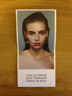
Perhaps have a face for the front cover.
Consider a contributions page, to state who has participated in what.
Feature street style (what the individuals wear who are featured in the photographs).
Make illustrative pages, use object and props to create imagery as apposed to capturing it on camera.
Concentrate on peoples attire, EG - shoes choice, jewellery or tops.
Maybe have a page featuring instagram imagery from the night or polaroid snaps.
Consider different layouts to present images.
Do a photography shoot for images for the flyers.
Reflect on information needed to be put on the flyer to inform guests.
Think about invitations/ tickets for entry to the event. Consider processes too.
Matching designs or not.
To have the promotional material work as a series within design.


No comments:
Post a Comment