Wednesday, 20 February 2013

Secret 7: Haim sleeve

For this brief i decided to take the photography approach and capture images which reflected journeys, matching the concept of the song 'better off' meaning going from one place to the next physically and emotionally. 

Below are the selection of images I have taken using hipstamatic prints whilst on a train journey home, the travels reminded me of the song and gave me a fine example of how to show words through imagery.


Final sleeve design:

I wanted to produce something something visually appealing to all that could remind someone of a place they have been before in relation to memories or feelings much like how the song is written.

Concept - Journey/ Travels/ People/ Leaving/ Going back


What is good - Format examples/ Crit 2

During todays crit we had to present the research we had discovered about the chosen formats, and receive feedback about our findings, below is the feedback i received in relation to perfume samples.

Feedback:

- Look into unconventional perfume samples
- Look into different materials used in perfume samples, how i could mock them up in the studio
- What materials are viable to spray perfume onto for testers

After this we were then asked to make lists about the chosen formats, below are the following.

Lists:

5 things i don't know about perfume samples:

- How the scent last on the perfume testers, in particular the card ones
- How an image is printed onto the plastic side of the peel of testers
- What is the name of the plastics/ glossy/ foil like stock
- How cost effective perfume samples are to make, and to put into magazines
- Can ink be printed onto the perfume sample stock, or does it always have to be plain to not counteract with the fragrance

 5 processes i dont know, which i might apply to work:

- Embossing and debossing on materials that hold perfume scents (paper, card, foil etc)
- Spot colours/ varnishes, how they can be applied to packaging
- Foiling/ foiling onto perfume packaging
- Laser cutting, intricate designs, detailed packaging design
- Glitter and metallic varnishes, for experimental processes

3 things about the product i like which could be improved:


- The glue applied to the back of the envelope sample, which sticks the object to the page in a magazine gets dirty easily, making the appearance of the sample do from chic to tatty
- Although the simplicity of the design works, it may appear a little bland to non-design enthusiasts
- The shape of the sample could be a little more adventurous, as apposed to a regular looking envelope

3 resesons why i like it and what is good about the design:

- Looks classy, stylish, fashionable and reflect Dior
- Appropriate stock used with simplistic finishing elements such as laser cutter and foiling
- It's playful as well as visually pleasing
- Good use of shape placement in the design
- Folding techniques work well on the tester inside the envelope, also compliments the embossed text and image


Research task:

A task set by Loraine and Simon today was to investigate on of the following areas in relation to our chosen 'good' thing:

- A brief history of ..
- A collection of ..
- An introduction to ..
- Things you should know about ..
- An exhibition of ..

Tuesday, 19 February 2013

What is good - Primary research/ Perfume testers

Here is a perfect example of an attractive perfume format, i came across this tester in Vogue magazine, it's purpose is for the reader to engage the promoting brand and to interact with promotional object, this being a perfume tester for Dior. These perfume testers are often found stuck onto a page in a magazine. 


The small white envelope is made from a glossy stock and has a the classic Dior logo debossed an foiled as a finish. 


The classy looking envelope has a scented piece of card inside which smells of the promoted perfume, its an interactive and tempting tester due to the laser cut diagram of the perfume bottle as well as has intricate designs on the front of the card. 


Another example of this is the Miss Dior perfume tester, i believe this has a similar look to the previous example as it is by the same brand Dior. 


The slight design differences are the shape of the envelope as well as dogtooth/ floral pattern embossed onto the scented card. These types of processed are something i will bare in mind for if i wish to design something similar at a later date. 


Another ideal example of how testers can be applied to a magazine page, this type is more of a sticker, on the front there is usually a printed perfume bottle and logo which incorporates into the design of the page spread. And on the reverse side once unpeeled is a silver foil with a scented fabric attached whereby the user can test the perfume on their skin. Below is an example of how this is put into practice in the male Viktor & Rolf fragrance advertisement. 


A few more variations of this type of tester design for female fragrances. 


What is good - Primary research/ Perfume advertisements

So today i decided to gather a little primary research, i wanted a collection of printed visuals which are published in many fashion magazines such as Elle, Bazar and Vogue. Each of the images show a different perfume, and a different method of advertising for each brand.


A recurring theme through fragrance advertising, especially when promoting female perfumes, there tends to be a female depicts in the ad as a face of the fragrance, a focus to sell the perfume just as much as the intent for it be be worn by a woman.


Another aspect i have noticed when browsing magazines is that when a male is in a perfume ad or is the face of a fragrance, it tends to be in black and white. I imagine this is to promote classiness. 


What is good - 5 examples of branding workshop

For todays session we were asked to bring in examples of branding as well as tangible objects to use for a group discussion, below are the printed out branding examples i brought as well as some printed examples of perfume packaging.

Branding

Packaging

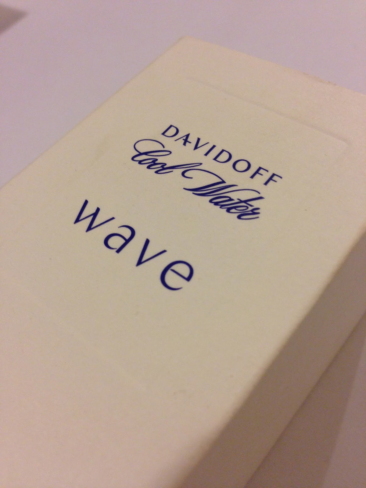
Here are few examples of perfume boxes all for different brands


After we discussed our branding examples we then spoke about the break down of each of our branding products, here is an example of how the discussion went. 

Kate Moss Perfume 


Target audience - 18-25, young females, fashion lovers and trend followers, icon admirers 

Product placement - Fragrance stores, on shelf presence with other perfumes 

Audience interaction - Box opens up, inclosed is the perfume, box and bottle could be kept as a collectable item

Stock - Pink metallic card, black spot varnish floral design

_ _ _ _ _ _ _ _ _ _ _ _ _ _ _ _ _ _ _ _ _ _

A research task set by Loraine was to find a minimum of 5 formats that appeal to me in the professional practice. 

Considerations:
- Stock
- Sustainability 
- Durability
- How these things go together 
- How does it physically become an item 
- How is it produced in the commercial work place 
- Look at how mock ups could be made
- How long would it take to make in a commercial and studio environment 
- Production methods