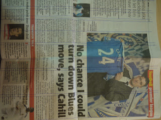
For Lorenzo's workshop we were asked to bring a template of a basic 16x11cm thumbnail to work from.
Here is the grid line ruler we cut out to help us measure accurately for the task.
Initially i didn't understand the idea at all, but after few attempts i grasped how type and grid worked and why it was necessary, i feel this is a task i need to experiment more with to fully understand layouts on a page.
NOTES:
Type and grid
- Components
- Weights and sizes
- Styles
10pt leading 10/14pt
For body type 4pt
X Heights:
- Can't judge point size by the X height
- Same point size but different X height impact on visual size
Using type:
- Readability
- Hierachy: Headings, sub headings, running heads, intro body, captions, folios.
- Specials, breakouts, pull quotes, drop caps.
Transport and medium:
-Font transport, medium and bold were produced in the UK 1958
Reverse out:
- Switch 'black and white' foreground and background
Tints:
- Different emphasise through colour
Layout:
- Application (bible, cookbook, manual, novel, script, magazine)
- Grids
- Conventions, paras, columns, justified, line length


No comments:
Post a Comment