Monday, 31 December 2012

Design for web: The bag page development

Again i stuck to the grid and developed my 'The Bag' page, this pages consists of a scrolling text box, illustrations and a quote. 


Below is an image of how the page will first appear once clicked on, the black bar in the middle is drawing of a scroll bar, this is so that the user can scroll down and see the selection of iconic bags through fashion history. 


Heres is the development of how i drew some of the most iconic 'IT' bags:

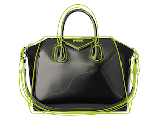
Below is the process for how i sketched each handbag on illustrator, i outlined the handbag, coloured areas, highlighted sections and played with the opacity on each to develop a reflective look. I also added gradients to some of the bags for certain areas such as metal logos, chains etc. 

Givenchy Antigona


Here are the complete selection of handbag illustrations, over all i am happy with the outcome, the only fault is the slight inconsistency in design, some of the handbags didn't look right with highlights and as the original images of them didn't show that, so making them was a little more tricky than the Chanel collection. 


Thursday, 20 December 2012

Design process/ Responsive: Douwe Egberts idea development

To do list

- Document all initial research
- Create awareness of brand
- Develop popularity
- Start designs

Further Research

- Coffee competitors (Nescafe, maxwell, Carte Noire etc)
- Look at Costa and Starbuck, see what the target market is, branding tactics, what they offer for home coffee drinkers

Product Research

- Campaign and event ideas
- Collectable products
- Hampers, gifts, seasonal? Christmas, easter, birthdays, valentines
- Catch could be, 'the coffee jars you buy the better gifts you receive'
- Look into gift ideas (recipe books, tissues, chocolates, magnets, cork ends for wine bottle, candles, mugs)
- Douwe Egberts - Recipe book 'Get people more interested in baking through cooking'

Wednesday, 19 December 2012

Design for web: Bagology page development

For this page i wanted to use a gif again, because the illustrations i drew would be more suiting to a larger scale, so the only thing that change about the wire frame was that the slideshow fit into one column instead of two. 


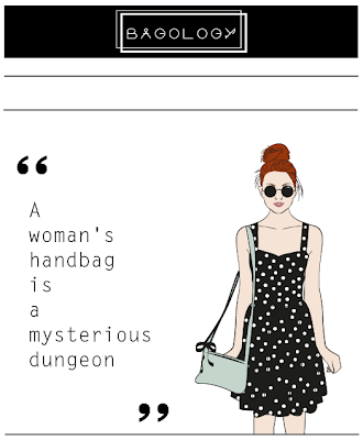
This is the first slide of the gif/ slideshow its for the viewer to question and grasp what a handbag means to an individual. 

For the next stage i decided to focus on the Chanel handbags, purely because i like the colour, shape and style of them, i thought having a sequins of bags for the gif would be best suited. 

Here is the development of how i illustrated the handbags. 

Chanel Backpack


Final backpack illustration

Chanel Clutch


Final clutch illustration 

Chanel Tote


To get the quilted look of the infamous Chanel bags i simply played around with the opacity of dark tones, and added gradients to areas of detail when necessary.

Over all i'm really happy with the illustrations, i think the black and gold colour palette defiantly works well for the bagaology page. 

Chanel collection - Illustrations 


After this i mocked up each page for my slide show:

Slide 1: A question and answer about what bagology is thought to be.


The definition of what small and large bags represent.


An illustration of a type of bag used and the and what it represents in a person. 


Here is a preview of how the slideshow will look and what order it will work in:


Tuesday, 18 December 2012

Design process/ responsive: Douwe Egberts crit feedback 2

Crit feedback

- Great idea
- Would work well appropriate time scales, seasonal
- Campaign sounds relevant to create awareness
- Stick with one idea for designs, and propose the rest
- Print on cellophane for wrapping perhaps
- Look at Fortnum & Mason hampers
- Need to design, have progression
- Look at statistics, who drinks coffee, how many jars of coffee are bought per year, look at different brands

Friday, 14 December 2012

Design for web: Quotes page development

For  each of the pages i have stuck with the same wire frame to make things easier for designing.
Here are a few images to show the process of how i developed my quotes page.


I chose to use a still illustration on the page, as a follow on from the gif. 

All the quotes on the page are from the Anita Daniel article - Inside story of the hand bag

A woman's handbag is a mysterious dungeon.

There is an aura of taboo about a closed handbag.

The typical handbag of a typical woman contains a certain number of fundamental things-plus her own individual touch.

Every woman's handbag is a lost and found department in itself.

It is strange, but things actually disappear there, as by magic.

No woman's suit pocket is meant to hold her belongings. 

The first thing Adam purchased for Eve was a handbag.

Some psychologists think the way a woman carries her bag is characteristic. “Bagology” is quite a science.

Money is the thing you will miss most frequently in a woman's handbag.

A woman without her handbag feels as lost as a wanderer in the desert. 

The handbag is the movable base of her supplies-the depot of her expected needs.

Every woman has an uneasy look if somebody glances into its sacred privacy.

A decent man should always tactfully stare at the ceiling whenever his companion opens her bag.

What female heart would not melt at the sight of a luscious alligator bag, or soft suede or brocade?

So women continue to carry handbags. As long as women do not wear men's suits with pockets, they will remain women.

There are a great number of women who hold their bags both by the straps and pressed under the arm.

Seen from the psychologist's angle, The way a woman carriers her purse demonstrates the entire scale of characteristics, from light-mindedness and generosity to caution and greediness.

One analyst warns men against women who keep their bag rolled around the wrist and the hand firmly clasped around the lock.

Tuesday, 11 December 2012

Design for web: Homepage development

After the feedback i received from the last crit i decided to go back to my original idea and base my website on the research i found about 'bagology'. As i have already designed posters and used information about the science into buying a handbag i think i would look good online as a blog style website. 

New designed wire frame


Logo design


Below is a gif i made on photoshop from the vectors i designed, i had some help from my friend Josh to complete the process, overall i'm happy with the out come, this gif will be displayed on my home page.


Design for print and web/ ISTD/ Action plan

Target audience (Specified)

Gardeners who enjoy the practice of growing plants and tending to their life either as a job or a hobby, 35-40 years of age

Research

Look into the anatomy of typography
Discover plant biology 
Develop a breadth of visual and informative research about botanical life
Look at publications, website, books and guides about plants, life processes, evolution, living organisms, and culture to develop a better understanding about 'plantae' 
Photoshop and after effects tutorials 

Media 


Explore hand rendered type 

Create a title from a well executed typeface, using either photoshop or after effects to then make a time lapse of the word growing in the form of plants and flowers.
Design, and execute examples using the laser cutter from media development as well as a technique which may be used in a final product

Product ideas

Highlighted are my favourite ideas which i will start designs on

An A-Z zine of flowers

An A-Z of botanical plants (names)
A book about smallest to largest plants, with reference to type - lower case to upper case 
A guide of ocean to earth - plant evolution 
Plant/ flower tags - botanical illustrations and information about each plant (could be photographed too, product in context)
A book about how plants survive (climate themed)
A website, informative - a gardeners guide to growing plants
A website directory of plants and flowers - A = Algae: The largest and most complex marine forms are called seaweeds. etc An idea for the homepage - Use the hand rendered typeface to create a word 'Plantae' which will grow like a plant across the homepage p..l..a..n..t..a..e, each letter step by step growing into a word/ plant like form, soft ware to be used - after effects or photoshop

Design for print and web/ ISTD/ Design direction boards

Here are the design direction boards i presented to the class in todays crit. 'Not Just Fleurons'


Ideas 


Research 


Crit feedback:

Strengths

Well thought out
Type faces used in examples of work would work well for development
Clear direction of what you want to do
The range of different media give you a selection to play with, and develop from
Hand rendered type face would look good as a book cover perhaps
Good visuals and good amount of research brought to the crit

Areas for improvement 

What is the age group of your target audience, try to specify? 
How will it be informative, what information will you be given to the audience?
Consider products, draw mock ups, have a variety
Narrow dow the media, don't have anything too complex

Considerations

Installation or illustration based would work well for the brief, unsure about the two together
Stick with a hand rendered approach, then perhaps digitalise later 
Think about colour schemes and fonts used

Design for print and web/ ISTD brief questions

5 problems you want to solve:
- How to develop a typographic product
- How to inform others about botanical life
- Why plants, flowers and gardens exist
- What the variety of botanical there are
- Have a clear visual identity and appropriate concept

5 reasons why:
- To further my typographic skills
- To gain a knowledge about the concept of my brief and apply it to products which also inform others
- To explore the life of plants and better my understanding about any kind of topic to inform others
- To investigate the botanical life around the world, different countries, different plants
- Having a clear concept and final idea that will express something worthy about the brief in a clear yet artist way

5 facts about the subject and content:
- Some see gardening as a metaphor of life
- Gardening comes in different forms
- In all gardens is the presence of plants
- Plants consist of form, colour, smell, feel, association, size, texture etc
- All plants have a different name

5 facts about your audience:
- Gardeners who enjoy the practice of growing plants and tending to their life either as a job or a hobby
- Photographers capture imagery of botanical art in a contemporary form


5 ideas you want to communicate:
- An informative website about botanical life
- A website which instructs individuals how to maintain the perfect garden
- A foundation where by gardeners can buy accessories and equipment for their garden
- An A-Z of all plants in the UK
- Facts and tips about hare to take care of the life that grows in ones garden

5 possible outcomes (end products):
- A typeface illustrating elements of flowers and plants
- A website which delivers informative and educational information about garden life
- A website for sharing information about gardening (from gardener to gardener) this could include, tips, photos etc
- A subscribing magazine
5 ways you can distribute these products:
5 things that should be communicated:


Monday, 10 December 2012

Design for print and web/ ISTD Re-write the brief

' Not just fleurons '

The brief:
Develop an understanding of the world of plants, consider their form, colour, size, texture, smell, taste, feel associations, personalities and botanical names. Develop an appealing ad informative outcome which interprets and celebrates plants.  Use mixed media to produce the typographic piece from hand rendered, screen, print, 3d and installation and media would be appropriate if it's a solid concept overall. Show off your typographic skills and remember to include words and language that are relevant to the theme of the brief.

Target audience:
- Stores that sell plants and flowers
- Gardeners
- Flower and plant enthusiasts
- Travellers
- Artists and photographers

Considerations:
As the botanical world is paradise of green tones and rainbow colours, the typography should follow these themes and be inspired the garden life.

Background:
Show an understanding of typography and how it can be used by applying element of the brief to it. Investigate thoroughly into the concept of the garden and the idea of flowers, what they are, why they are here and what they are for. Show a breadth of visuals and informative research.

Requirements:
- Research and development
- Strategy
- Specifications/ Grids
- Dummy/ Prototypes
- Final product

Design for print and web/ ISTD Briefs

We are required to pick one of the briefs from the ISTD projects, below are the ones i have selected which i have interest in and i believe i could develop something creative from these as a starting point. 

Ideas:
60's theme
Comparing artists
Songs that relate
Motion graphics
Short video
An advert
Interactive typography
Consider different eras, the change in music
Style of music reflect in design of type


Ideas:
Theme of 100
Fashion, music, art
Sport, science, literature, history


Ideas:
Cityscape/ Landscape
Installation or wall art
Graffiti inspired
Stefan Sagmeister like?
3d type
Objects used, natural, manmade
Select locations, beaches, fields, car parks, subways, derelict buildings etc


Ideas: 
3d type design
Installation
Photographs of botanical life
Flowers, plants, gardens
Different cultures
Consider colour, size, texture, smell, taste feel etc

Design for print and web/ Brief

Brief

Produce a body of work in response to one of the given briefs that demonstrates your understanding of design for Print AND Web-Based delivery. You should use the brief as a starting point that you can extend/expand in order to evidence your ability to design for cross media delivery. You will need to identify a point of focus (Print or Web) and present  products in their appropriate format. Any remaining deliverables can be presented as proposals with full artworks and supporting media.


Brief considerations:

Demonstrate an understanding of design and print
Use the brief as a starting point
Expand ideas
Mixed media delivery 
Document progress and research on DP and DC
Design for an audience
Demonstrate industry standard requirements 
Consider production methods
Stock and colour systems
Commercial costings
Correct labeling on blogs
Include mock ups
Final products
A fully functioning index file, ready for hosting
A pdf of 5 presentation boards (posted to DP via issuu)
Practical, conceptual and technical decisions included

Studio deadline and module deadline: 30/01/2012 - 2pm

Saturday, 8 December 2012

What is design for print: Finishing experiments/ Foiling

Today i decided to practice doing some foiling, my original idea was to encorporate xamples of foiling into my info pack design, perhaps have a section of finishing examples how ever i would much prefer to use a technique such as embossing or foiling for a front cover. 

Here are few images showing the process of foiling. 

For these quick testers i just used the laminator, normally for the foiling process you would use a heat press, however these were just experiments. 


For this i printed off the the title 'Print Info' and placed a selected foil over the top and put it into a card folder before putting through the heated laminator. 


The result shows how the foil sticks to the ink through because of the heat, i particularly like this type of foil as i think is would look good on numerous stocks. 


I thought it would be useful to experiment with different stocks as well just to see the difference in outcome. 


A different foil i picked was a champagne gold, another nice foil which looks polished once finished.