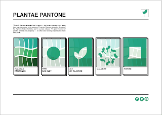
To start off my website i stuck to a grid to give me an idea for how i wanted my webpages to be laid out, the following development shows how i progressed with my webpages.
Creating pages for the website, the 5 buttons are inspired by the shape of a pantone colour example.
Still using the Emerald green through out the design as it is the attraction colour, i wanted to engage with the audience through the colour of green as a constant reminder of plant life.
I decided to use a hue colour to be used for the plantae pantones button as this will make obvious to the user what the following page will be about, this being the intensity of saturation of colours that represent plant life.
A few experiments to with composition of the colours, i used different warp effect such as fisheye, wave etc.
I wanted the colour scheme and imagery to be consistent throughout the designing of the website and any promotional material so that the link is as obvious as the concept.
Testing plain buttons or drop shadow versions.
I think applying social networking logos to the website will give the viewer an inkling that Plantae Pantone has links with sites such as Facebook, Twitter, Pinterest and possibly Instagram, meaning that the website is all about interaction and sharing information, imagery and learning new things.
Final homepage layout consisting of a logo, an explanation about Pantone colour of the year - what it means, five buttons for the user to click on one page to the next to discover information about the website, why its active, how to use it, what its for and why its useful for a person interested in gardening.


No comments:
Post a Comment