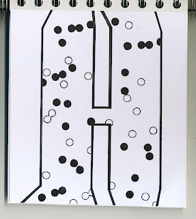
For this task I had to produce a set of 10 letters which explored and communicated the interpretation of the word 'condense'.
I based my letter form from an existing font 'helvetica', i wanted to use a simple legible font which i could develop and expand my ideas from. The format was 15 x 15 cm, with a limited colour palette of black and white.
Initially i found the word condense hard to work with, unsure what definition to side with, or whether to develop letters that resembled the word as a full set, or as a ongoing set, or to have each letter individual.
I began to work on the 15 x 15cm scale, and produce letters which i felt related to the words condense, for e.g 'to reduce to a smaller scale' therefore i was working within the letter form itself, designing patterns and working with scale and size of the inner part of the shape. eventually i developed 10 letters, which overall was very time consuming, therefore my initial ideas were in fact my final 10.
i'm happy with the style of letters i designed, but i don't feel they fully suit the word condense.
Never the less, here are my final 10 designs:


No comments:
Post a Comment