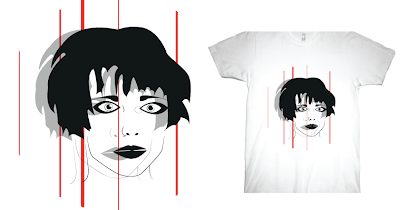
Tuesday, 30 April 2013

Exhibition poster - Workshop

Today we were put into groups to be able to generate ideas for the brief. We created lists of words which associated with an exhibition space, change and the target audience.

Group work:


Exhibition:

Spectacle
Public
Clinical
Showcase
Communicated
Discover
Present
Opportunity
Interaction
Observational

The space itself:

Traffic
Platform
Recreational
Educational
Environment
Walkway
Relaxed
Walkway

Changes:

Revolver
Adapt
Alternate
Seasons
Regenerate
Trends
Cycle
Evolve
Metamorphosis

Bi-Monthly:

Reflection
Parallel
Periods
Two
Fresh
Inspiring
Time
Turnover

Space:

Site
Frame
Public
Limbo
Gap
Empty
Light
Territory

Graphic Design:

Geometric
Lucid
Communication
Shape
Community
Process
Intersect
Crop

Exhibition poster - Brief

Brief

Produce a poster to promote an exhibition space in the Graphic Design corridor. You are restricted to producing your design to fit within an A1 frame, working space A2 including mount.

The Exhibition space will be utilised on a bi-monthly basis, rotating between entries from level 04 and level 05 students on the Graphic Design course. The theme for the content of the space will also rotate on a bi-monthly basis. The exhibition will begin in October.

Background / Considerations

Although you are restricted in regards to the format and size you should consider working across a broad range of media and formats that are appropriate to your concept.  Your response should explore the relationship between the method of distribution, format, location, whilst also analysing context, audience and tone of voice. 

Your content should explore and apply a range of appropriate practical and conceptual approaches as well as being technically competent and contextually appropriate.  Your resolutions should demonstrate an informed understanding of issues relating to media, communication, audience and function.

Mandatory Requirements

You will need to evidence research, development and production of your resolutions through your design context and design practice blogs.

Your work should be documented through regular labelled posts to your Design Practice and Design Context Blog.
Correct labelling of your work on your blog is essential.  Failure to organise your work clearly will affect the assessment of your work.

Deliverables

Conceptual development work, presented on design boards.

3 conceptual resolutions.

1 finished poster, printed in your chosen format. You are restricted to resolving your print in the following formats:
Screen Printed
Hand Rendered
Inkjet digital print
Laser Cut
Vinyl Cut


Studio deadline

08/05/2013 – 1pm

Module deadline 

21 / 05 / 2013 - 1pm

Wednesday, 17 April 2013

Responsive - Final evaluation


1. What skills have you developed through this module and how effectively do you think you have applied them?

The responsive module has thought me that I can work collaboratively really well, the skills I have developed in doing so are being more organised, producing more work than usual and making a lot more effort in a brief as someone else is counting on my efforts. I believe my software skills have improved, such as photoshop given that I edited a lot of photography work for the briefs I chose to do. Another is my communications skills, when working on the Dazed & Confused brief Emily and I had to share ideas and work separately sometimes, but good communication payed off as the final result of the work was well produced by the pair of us. 

2. What approaches to/ methods of design production have you developed and how have they informed your design development process?

I feel I have enhanced my photography skills, and using imagery in my work has been different to the usual vector based work, this is something I would like to take further as I want to learn more in photoshop and how to manipulate photographs to a high standard. A lot of my primary research has helped me throughout the briefs, just taking a few hours a week to go out and take photographs or gather products which will inspire me for later work has been worth while. 


3. What strengths can you identify in your work and how have/will you capitalise on these?

When I was approached to do the logo for Copper Beech Acoustic, which I later fully branded I realised that branding and identity is a sector within design which I really enjoy and that I actually grasp. Doing smaller briefs such as Secret 7 and Threadless were the ones I most enjoyed as I took the photographic and illustrative approach for both, both are strengths of mine which I want to pursue further. 

4. What weaknesses can you identify in your work and how will you address these in the future?

Any work wish has been rushed too quickly shows lack of creativity, this was shown in the Creative Networks brief, the work I produced wasn't great nor of a decent standard. Making more effort and taking time on designs needs to be addressed more in 'quick turn around briefs'.  I believe I could have done more briefs throughout the module if I'd of used my time wisely.

5. Identify 5 things that you will do differently next time and what do you expect to gain from doing these?

Use my time more effectively to be able to produce a better standard of work, and work that I am more pleased with. 
I wish I had produced print based work as apposed to proposal work, if I had of managed my time better I might of changed my designs after printing and mocking up first. 
I would have looked at a wider range of briefs, although there was a lot to choose from on YCN and D&AD, unfortunately I wasn't awfully keen on the many of then, I should have broadened my ideas by looking at different briefs, and  this may of resulted in me producing more satisfactory work. 
Perhaps exploring more with illustration would of been good as it is what I like to do most, for example in the Secret 7 briefs, this is something i will consider next time. 
When collecting secondary research I should look at a wider range of websites, as exploring through design work can seem a little repetitive, I will also use library more to look for inspiration designers and artists.

6. How would you grade yourself on the following areas:

Attendance: 3
Punctuality: 4
Motivation: 4
Commitment: 4
Quantity of work produced: 3
Quality of work produced: 4
Contribution to the group: 5

Project Report Book

Tuesday, 16 April 2013

Concept workshop

Today's session was a quick concept workshop, we had to ask ourselves what a concept is?

- An idea
- A plan
- A way of thinking
- A message
- Guidelines
- Possibilites

Simon informed us about an existing hotel in London known as the ampersand, which has a unique design approach to the interior decor and product design within the hotel.

An example of the slogans used are 'cats and dogs'

We were then asked in our groups to generate ideas for the hotel, below are a few of our examples:

Slippers: Warms & Toasty/ Nice & Comfy/ Left & Right

Breakfast menu: Rise & Shine/ Wake & Bake

Key card: In & Out

Crockery: Pour & Sip/ Hot & Tasty

Towels: Wash & Dry/ Nice & Clean

Saturday, 13 April 2013

Threadless - Final designs

After downloading the template canvas I resized my images to fit the template, here are the four final designs which I felt most happy with:


I decided to mock the designs up on more material such as jumpers and iPhone cases to see how the designs ran on other products. 


The iphone cases are my favourite placement of designs, I think they suit the theme of design and would look appropriate if they were real. 


Friday, 12 April 2013

Threadless - Design development

For this brief I decided to tackle it with an illustrative approach, I wanted to create illustrations of artists from a band called crystal castles. Below is the design development showing each stage:


I wanted to experiment with patterns in the illustrations to create a vivid look through them.


I decided to create four illustrative piece that reflected crystal castles and that would suit being placed on a t-shirt design. 


Wednesday, 10 April 2013

Threadless - Brief


I decided to enter another competition brief called 'thread less' the idea is that you think of ideas and create designs which can be applied onto t-shirts and other materials. 

Submission guidelines and assest

- Three-slide submission example
- Create a high resolution version of your design. Keep your layers separate.
- Create a 72 dpi flattened copy of your design.
- Download a template of your canvas below.
- Drop your flattened copy onto one of these templates or create your own.
- Your submission should be no more than 845 pixels wide, 445 pixels tall, and 72 dpi.
- Save your file as a jpg.
- Submit up to three slides. One slide should show your design on a template. The other slides can be closeups, different canvases, or alternate color schemes. All three of your slides combined should be under 250 KB.

Sunday, 7 April 2013

Copper beech acoustic: Branding and identity

Below is the variation of branding options I have designed which includes business cards a cd cover and a slip in poster. These designs are only a starting point for me as I will prepose them to the clients in May, I aim to further the designs based more of the footage from the future videos the collaborators will make in June/July. 


Copper beech acoustic: Posters

I decided to create some small posters which could be folded up and put inside of the cd covers, they are art like imagery showing the copper beech tree and some logo imagery, I believe all in all the work contains and identity running from the business cards to the posters. 


Copper beech acoustic: CD packaging

To further the designs I decided to create some CD packaging which could be used for the clients when they produce the video and a series of tracks from it. 

I wanted to repeat the use of photography in the work and keep it consistent by showing a variety of copper beech tree edits. 


I think the covers look simple and effective and are a reminder of home (Cumbria) which is a main theme in the brief, to raise awareness of musicians in the lake district. 


Saturday, 6 April 2013

Copper beech acoustic: Business cards

Below are the business cards I developed and designed for Copper Beech Acoustic, over all I am happy with the end result and the variety of cards produced. 

I stook to a standard business card size 90x50mm.


I made slight alterations to the logo design on the cards and adjusted the placement in some areas, I feel this show the alternative concept behind the designs. 


Friday, 5 April 2013

Copper Beech Acoustic: Business card development

This initial brief set by the clients was to only design a logo, how ever I wanted to extend the brief a little to produce more work, I informed the clients about my ideas and they were happy to use the graphic pieces which I produce. 

I used the colour palette to apply duotone effects to the image of a copper beech tree. 


I then edited the images into circular shapes to apply to the logos.